
Part 1 of 3: Defining the needle and the haystack
Finding the right location for an infrastructure project means solving a multidimensional optimization problem where all the variables interact in complex ways. How much does grid power price matter compared to land cost? What about solar availability? How do you weigh transportation infrastructure against the regulatory environment? How do you move fast, while also meeting your critical economic and sustainability goals?
The traditional approach involves firing up GIS tools, gathering data, and trying to filter through data layers with different time periods, formats, etc. This can include factors such as electricity prices, infrastructure maps, land costs, renewable resource maps, and many, many more. Maybe you have a secret sauce, but I bet you’ll miss hidden gems - the sites that aren't obviously attractive but deliver exceptional economics when all factors are considered together.
We've been working on a different approach: searching based on the characteristics of an individual location AND how all of those factors come together into the north star for most developers, operators, and financiers - the ROI of your project (NPV, IRR, LCOE, or whatever metric means success for you).
This article will first talk about the challenges of our initial approach for modelling hydrogen production costs. We’ll then describe our new approach: allowing users to upload their own project economic models to be run on our data platform. To wrap up, we’ll outline the next two blog posts: how we execute user provided economic models on our GPU-accelerated optimizer, to find the perfect sizing and configuration for your project; and finally, how we use neural networks to run your optimized economic model over the whole globe, allowing you to find your needle-in-a-haystack with a simple search.
When we built our first tool, for hydrogen project siting, we took what seemed like a reasonable approach: we built a comprehensive LCOH (Levelized Cost of Hydrogen) model that captured all the key economic factors and allowed users to customize the variables that mattered most.
Users could adjust numerous factors including:
The system would then calculate LCOH and IRR for any site using our hardcoded model structure. It worked well for standard projects, but we kept hitting the same wall: users wanted to modify the model itself, not just the inputs. We also wanted to expand our platform to projects other than hydrogen production, such as data centers.
We realized we were solving the wrong problem. Instead of building increasingly complex configuration options for our hardcoded model, we needed to let users bring their own economic models entirely.
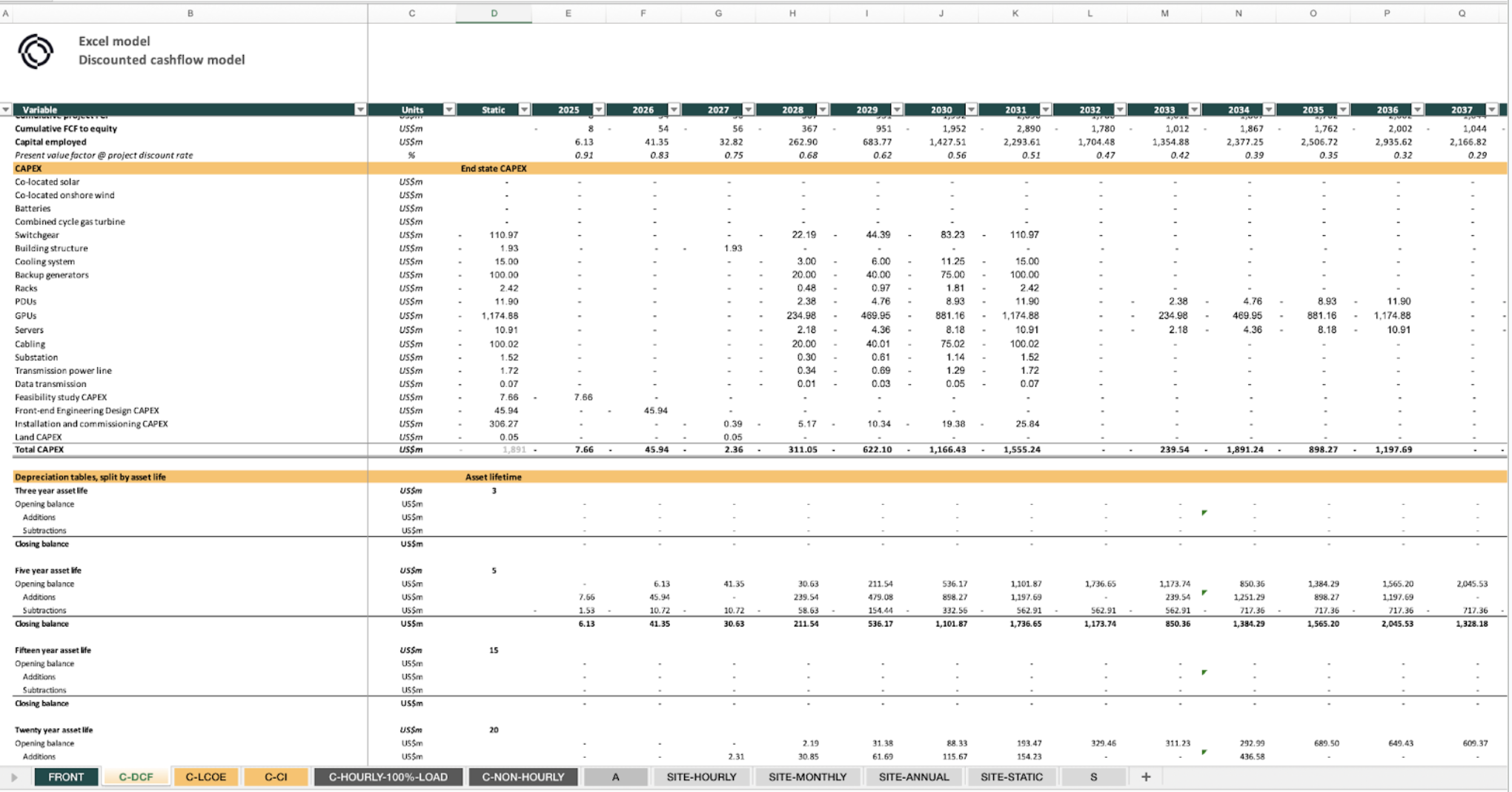
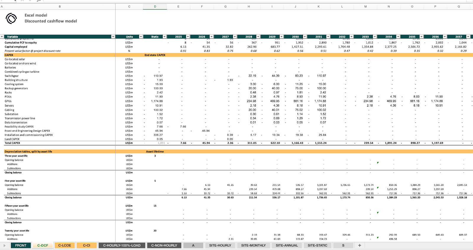
The solution turned out to be surprisingly straightforward: let users upload their own Excel models.
We created an Excel template that defines the interface between user models and our geographic data. Users can either customize one of our provided models or build their own from scratch. The template handles the data injection - our system knows how to feed location-specific data into the designated cells, and the model handles everything else.
This approach preserves the sophistication of user models while enabling them to run anywhere in the world using our data platform. Your carefully crafted depreciation schedules, custom financing structures, and cost models all work exactly as designed - dynamically fed with real-world data.
The process is simple:
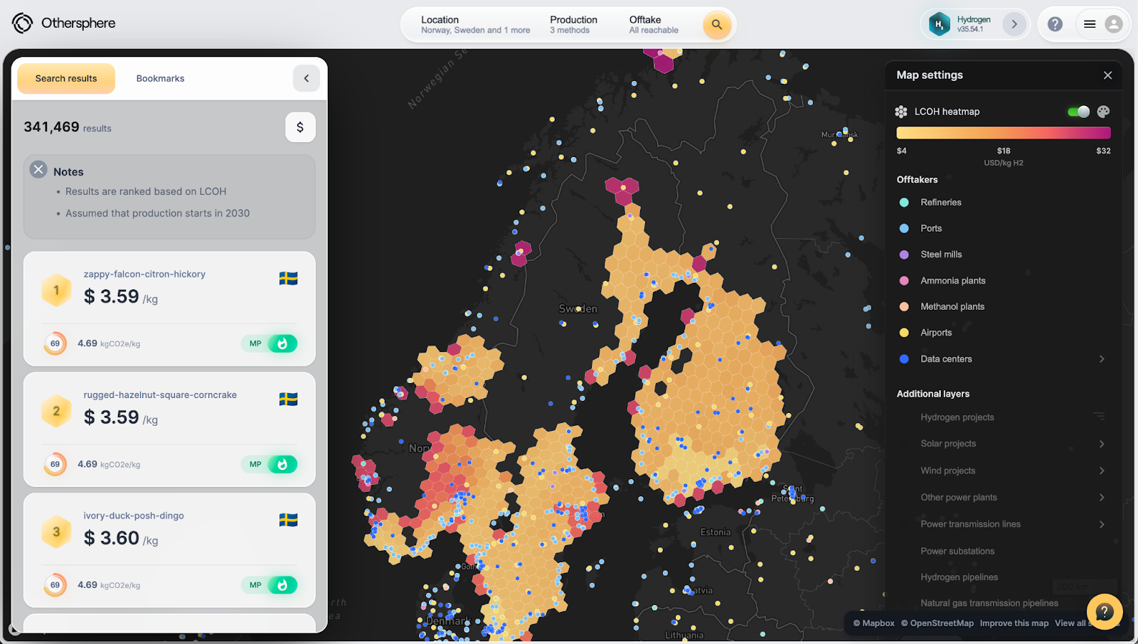
Behind the scenes, when you click on a site in, say, Wyoming, or Bavaria, our system instantly injects our rich datasets for that location, including:
Your Excel model processes this data exactly as it would with any other inputs, but now it's using real-world, location-specific information saving you the trouble of finding the data or the dangers of generic assumptions. The power of this is also in the comparative view, so rather than just evaluating one site to see if it clears your viability hurdles, you can evaluate any site to find the strongest option. Choose exceptional, rather than just acceptable.
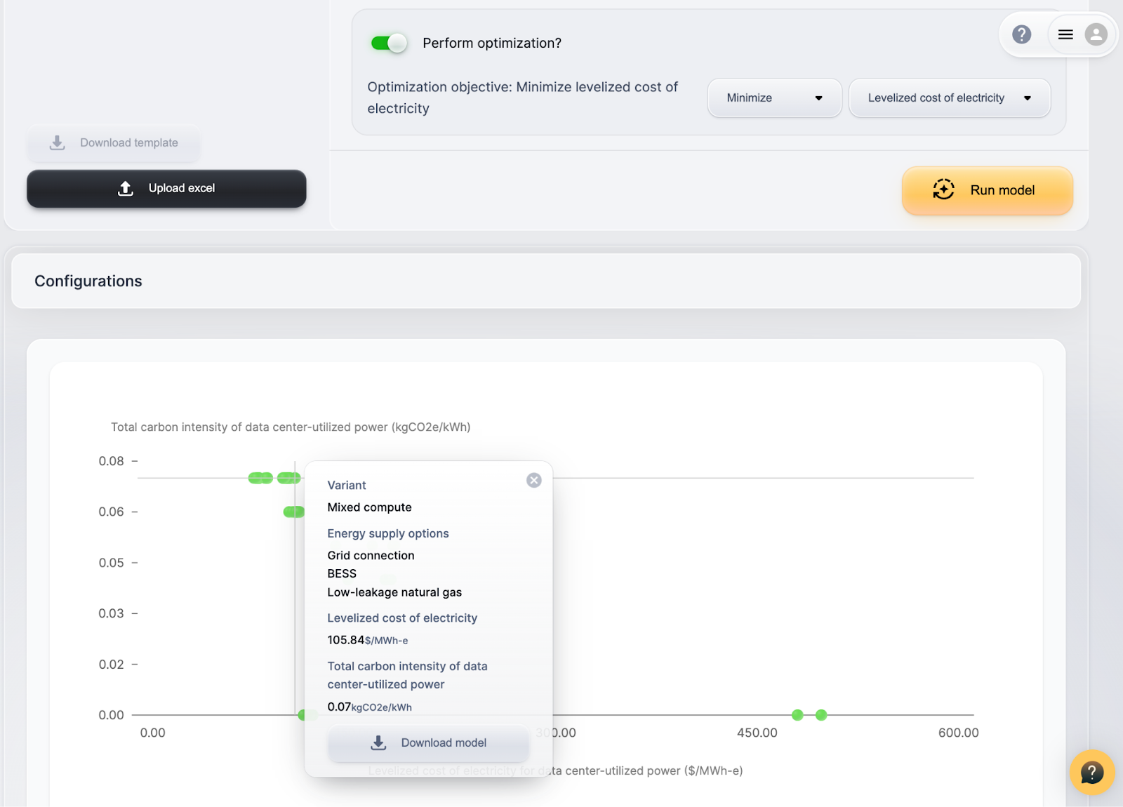
You can export your model with these values injected, or browse the data within our Explorer tool. (You can also click to run our GPU-accelerated optimizer, but that’s for the next blog post.)
The complexity multiplies when you consider that you're not just searching for locations—you're searching for the optimal combination of location, project configuration, and operational parameters.
For hydrogen production, you might be evaluating:
For data centers:
Each combination creates a different economic profile, and the optimal choice varies by location. A site that's perfect for a GPU-intensive data center with solar power might be terrible for a CPU-focused facility relying on grid electricity.
Our Excel template lets you easily define these various options and, on choosing a particular site, our tool will run your model for every such option for you to then browse within our tool - or export back as an Excel file.
This Excel integration solves the flexibility problem—users can now bring their own sophisticated models and run them anywhere. But it doesn't solve the search problem.
In our next post, I'll walk through how we run your Excel models on our cloud-based GPU-accelerated optimizer. Rather than spend thousands of developer hours converting models for linear optimizers, take your Excel-based non-linear model and just throw powerful GPUs at it. Our technology is able to combine gradient descent with particle swarm optimization over millions of particles for truly exceptional results - out of the box.
The third post will cover something even more ambitious: training custom neural networks to approximate your optimized models. This is how users of our hydrogen product are able to search the globe based on factors including pre-optimized LCOH, and what we are now enabling on a fully custom basis. Once we have a neural network that can mimic your Excel model's optimized behavior, we can run it at every potential site worldwide, across all possible configurations, in a matter of minutes. This creates a true global search capability - the ability to find exceptional opportunities in a sea of merely acceptable options.
What we've built is a fundamental shift in how infrastructure projects get sited. Instead of searching based on individual factors and hoping they combine favorably, you can search based on actual economic performance. Instead of evaluating a handful of obvious sites, you can systematically explore millions of possibilities.
Your Excel model represents deep domain expertise about your specific project economics. Our platform just helps that expertise engage with the full complexity of global geography and energy markets. The results can be surprising - sometimes the best location for your project is one you never would have thought to evaluate.
Source:
Original data source:
Spatial coverage:
Visibility:
Methodology:
Download:
License:
The data provided herein is made available on an "as-is" basis, without warranty of any kind, either expressed or implied. The provider does not guarantee the accuracy, completeness, or usefulness of the information. By downloading this data, the user acknowledges that the provider shall not be held liable for any errors, inaccuracies, or omissions in the data, nor for any damages, losses, or consequences arising from the use, misuse, or reliance on this data. The user assumes full responsibility for the use of the information provided and agrees to use it with caution and at their own risk.
Click here to access the Othersphere Data Center Atlas
What does the market view as a good data center location? This is something we can clearly observe based on how data centers are deployed today.
But how will the definition of a successful project evolve over time? And how might this differ across different classes of data centers?
Planning for the long-term, it is important that markets and policymakers are intentional about their expectations and requirements for these assets, as the role of data centers in economic growth, energy demand, climate outcomes, and geopolitical stability will all undoubtedly increase.
Then in the near-term, the risk of data center investment bubbles and market swings appear very high. As such, the ability to target data centers with strong fundamentals that will succeed in both good times and bad is essential.
History smiles on those who build commoditized industrial infrastructure in locations with the best fundamentals, so who will be the 'Saudi Arabia of compute'? The race to acquire power for these information refineries is the dominant narrative today. But when the smoke clears it will be key long-term fundamentals that matter to operators, policymakers, investors, communities, and beyond.
With this framing in mind, this Data Center Atlas is our contribution to inform a more data-driven view of the shape of the global data center fleet today, and how this may evolve over time.
At launch this Atlas includes a sample of the metrics we use to evaluate existing and potential data center locations. Here we highlight trends at the thousands of sites around the world that host data centers today, drawn from the over 180 million locations that Othersphere models worldwide. We are also experimenting with AI-generated/human-reviewed context for each metric; with AI model outputs shaped by the data provided from our backend.
This living document is also a pilot for future report-centric products on data centers and other industrial sectors, helping us understand needs around:
Reach out to learn more or provide feedback, and in the meantime, thanks for reading!

What does the market view as a good data center location? This is something we can clearly observe based on how data centers are deployed today.

VICTORIA, BC, Sept. 9, 2025 /PRNewswire-PRWeb/ -- Othersphere announced its participation in Google's AI for Energy program, with the collaboration focused on accelerating deployment of innovative report-based intelligence products for data centers, hydrogen production, and other energy-intensive infrastructure.
Expanding on Othersphere's existing enterprise software products, these reports utilize rigorously structured platform data from Othersphere to guide generative AI—delivering powerful new products tailored to project or portfolio design and diligence.
Key Highlights
"By combining Othersphere's data and asset modeling with generative AI, we're giving infrastructure decision-makers something they've never had before: instant, reliable insight at the scale of the global market," said Robert Murphy, CEO of Othersphere.
Market Impact
These reports will be available on a standalone, targeted basis, and will also be integrated into Othersphere's Explorer software products. By layering narrative-level synthesis atop rigorous global data and detailed modeling, Othersphere enables:
About Othersphere
Othersphere accelerates deployment of high-performance industrial infrastructure. This search engine for sustainable infrastructure is driven by vast amounts of consolidated global data, and billions of bottom-up project models, across millions of individual locations. Backed by Breakthrough Energy Fellows, Othersphere enables infrastructure stakeholders such as project developers, OEMs, financiers, and operators to reduce costs, accelerate action, and improve long-term asset performance. Visit www.othersphere.io to learn more.
About Google AI for Energy Program
The AI for Energy program focuses on grid optimization, demand flexibility and energy solutions for customers, including utilities and commercial entities. By supporting advancements in areas such as interconnection queues and carbon-aware infrastructure, the Accelerator aims to drive innovation, sustainability, and reliability in the energy landscape. Learn more about the Google for Startups Accelerator: AI for Energy program here.
Contact
For more information about these new report offerings, or to explore integration into your work, contact:
Othersphere Systems Inc.
Phone: +1 (236) 428‑4400
Email: press@othersphere.io
Othersphere announced its participation in Google's AI for Energy program, with the collaboration focused on accelerating deployment of innovative report-based intelligence products for data center, hydrogen production, and other energy-intensive infrastructure development.
Please reach out if you would like to learn more about Othersphere, our products, and opportunities to partner in accelerating deployment of high performance, sustainable infrastructure


